Pixel Art poster series

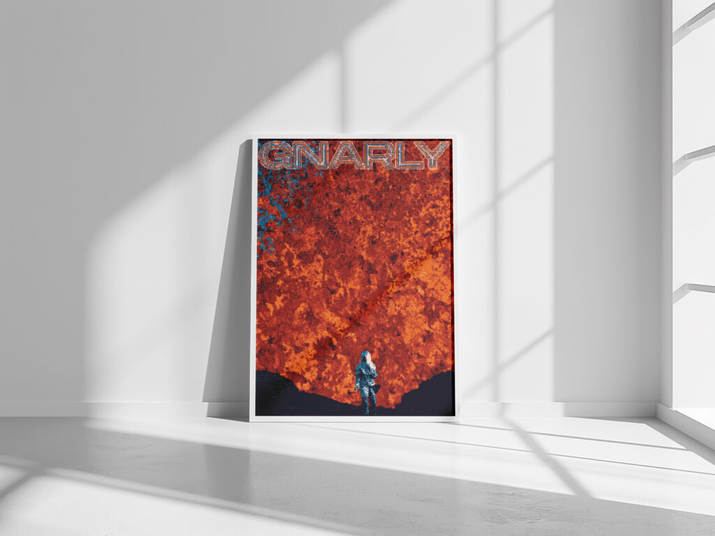
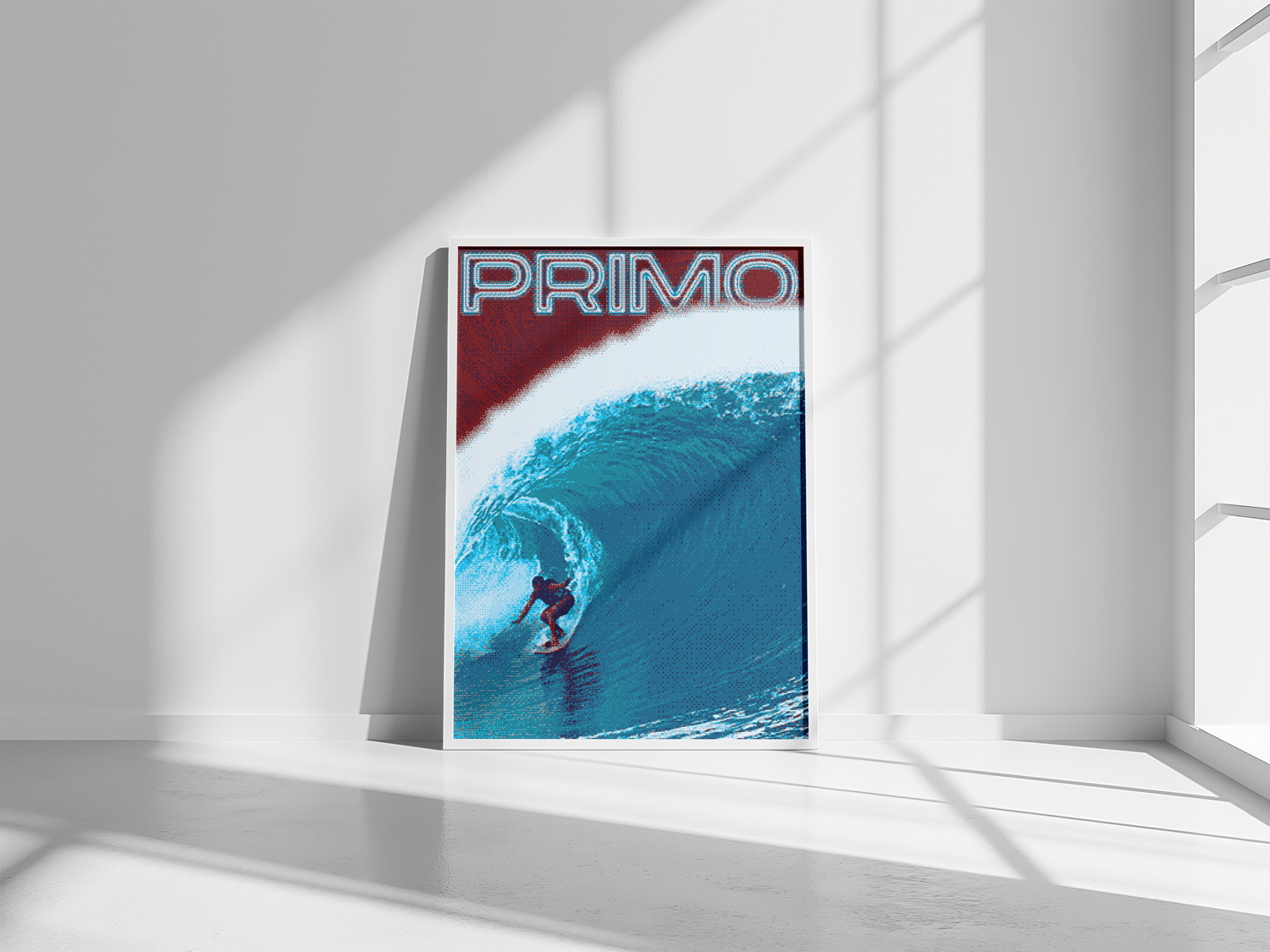
These series of posters are an exploration of pixel art, focusing on the unique aesthetic that minimal, pixel-based imagery can bring to visual storytelling. By working within the constraints of a pixel grid, I aimed to distill each design to its essence, using simple shapes and a limited color palette to convey mood and narrative. These projects allowed me to delve into the retro-inspired world of pixel art to create visually compelling, modern compositions

The Challenge:
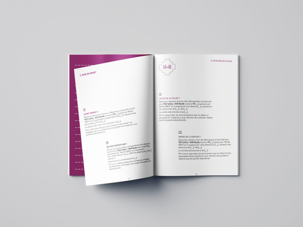
- Create a pocket-sized reference guide containing all possible PA announcements.
- Ensure quick access to equivalent messages across four languages.
- Maintain clarity despite space constraints. Design for frequent daily use.

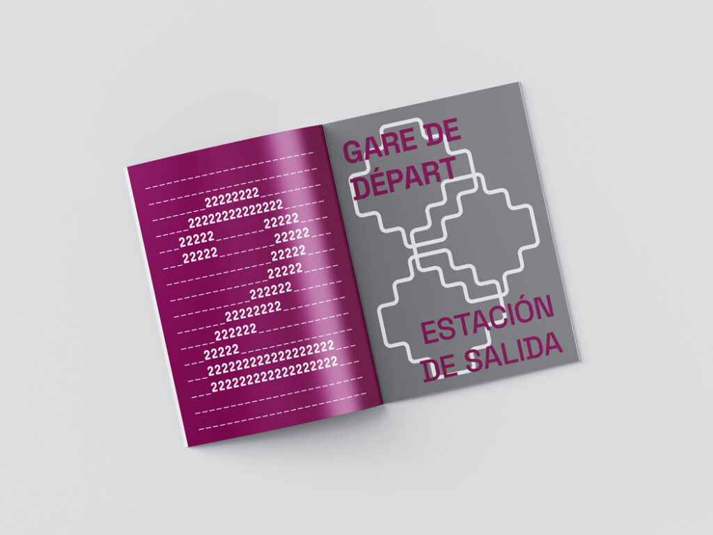
The Solution: a compact yet comprehensive guide organized by journey stages. Using a minimalist grey and magenta color scheme that reflects the company’s branding, I created a clear hierarchical system that allows controllers to quickly locate and deliver the right message in any required language.

The puzzle piece motif featured throughout the design symbolizes the seamless connection between languages and rail networks, while also serving as an intuitive wayfinding element. Strategic use of typography and white space ensures readability despite the dense information and compact format.

Client
Renfe-SNCF
Location
Barcelona
Categories
Graphic Design